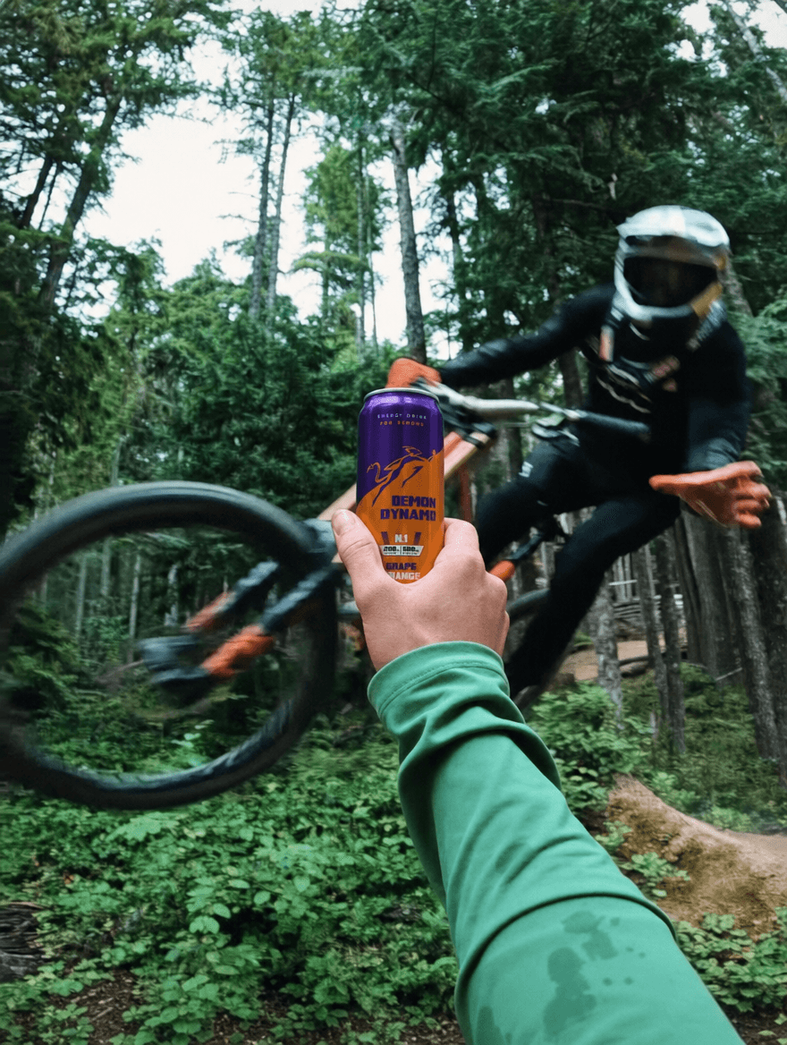
In a market flooded with options for casual consumers, Demon Dynamo is designed for those who push boundaries. Think ultrarunners, climbers, ER nurses, and anyone who thrives on intensity. Demon Dynamo offers quick energy from clean ingredients, made for the discerning few. More than just an energy drink, it’s about building a community for those who challenge themselves and strive for more.
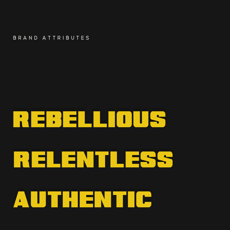
Demon Dynamo is a premium energy drink designed specifically for ultrarunners, climbers, and driven professionals. Rather than targeting the mass market, it focuses on speed, purity, and strict performance to support people with demanding physical routines. By blending a rebellious energy with a practical drive to improve, Demon Dynamo provides reliable fuel for anyone pushing their personal boundaries with the simple goal to “Go Beyond Limits.”
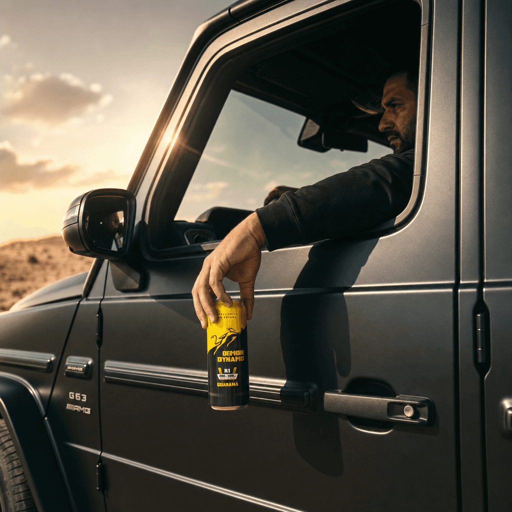
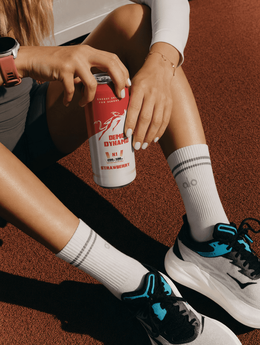
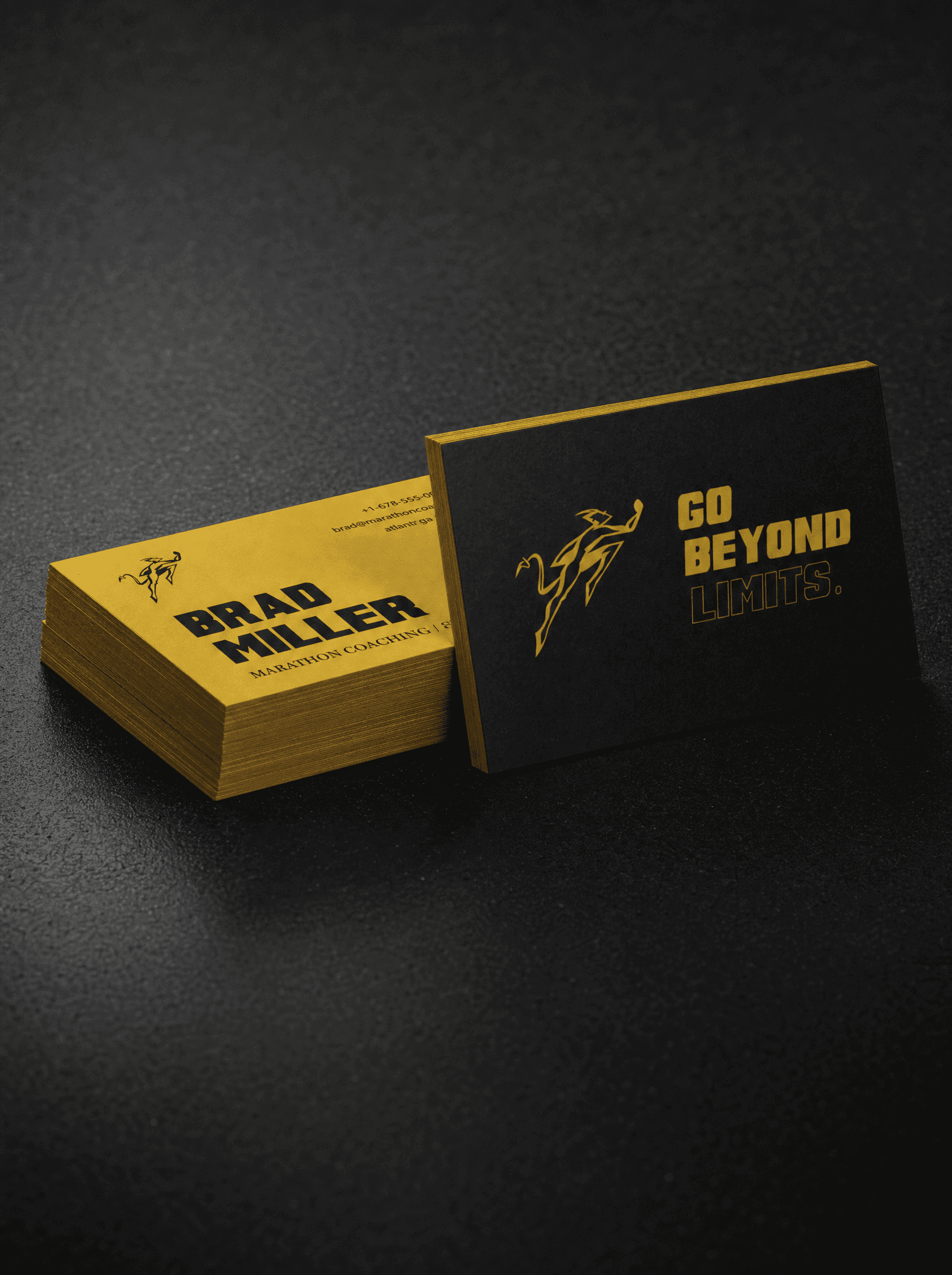
Demon Dynamo’s packaging is designed to reflect an active lifestyle. We use a black-and-yellow color palette paired with photos of climbers and ultrarunners to immediately communicate a focus on performance. The cans feature a textured finish for a practical grip. While black and yellow remain the base, each flavor includes a distinct accent color so you can easily tell them apart. For typography, we rely on Nexa for clear reading, paired with Super Retro M54 to give the labels a sporty and straightforward look.
Demon Dynamo’s packaging is designed to reflect an active lifestyle. We use a black-and-yellow color palette paired with photos of climbers and ultrarunners to immediately communicate a focus on performance. The cans feature a textured finish for a practical grip. While black and yellow remain the base, each flavor includes a distinct accent color so you can easily tell them apart. For typography, we rely on Nexa for clear reading, paired with Super Retro M54 to give the labels a sporty and straightforward look.
Demon Dynamo’s packaging is designed to reflect an active lifestyle. We use a black-and-yellow color palette paired with photos of climbers and ultrarunners to immediately communicate a focus on performance. The cans feature a textured finish for a practical grip. While black and yellow remain the base, each flavor includes a distinct accent color so you can easily tell them apart. For typography, we rely on Nexa for clear reading, paired with Super Retro M54 to give the labels a sporty and straightforward look.
Demon Dynamo’s packaging is designed to reflect an active lifestyle. We use a black-and-yellow color palette paired with photos of climbers and ultrarunners to immediately communicate a focus on performance. The cans feature a textured finish for a practical grip. While black and yellow remain the base, each flavor includes a distinct accent color so you can easily tell them apart. For typography, we rely on Nexa for clear reading, paired with Super Retro M54 to give the labels a sporty and straightforward look.
PRODUCT CREATION
Demon Dynamo’s packaging is designed to reflect an active lifestyle. We use a black-and-yellow color palette paired with photos of climbers and ultrarunners to immediately communicate a focus on performance. The cans feature a textured finish for a practical grip. While black and yellow remain the base, each flavor includes a distinct accent color so you can easily tell them apart. For typography, we rely on Nexa for clear reading, paired with Super Retro M54 to give the labels a sporty and straightforward look.
Demon Dynamo’s packaging is designed to reflect an active lifestyle. We use a black-and-yellow color palette paired with photos of climbers and ultrarunners to immediately communicate a focus on performance. The cans feature a textured finish for a practical grip. While black and yellow remain the base, each flavor includes a distinct accent color so you can easily tell them apart. For typography, we rely on Nexa for clear reading, paired with Super Retro M54 to give the labels a sporty and straightforward look.
Demon Dynamo’s packaging is designed to reflect an active lifestyle. We use a black-and-yellow color palette paired with photos of climbers and ultrarunners to immediately communicate a focus on performance. The cans feature a textured finish for a practical grip. While black and yellow remain the base, each flavor includes a distinct accent color so you can easily tell them apart. For typography, we rely on Nexa for clear reading, paired with Super Retro M54 to give the labels a sporty and straightforward look.
Demon Dynamo’s packaging is designed to reflect an active lifestyle. We use a black-and-yellow color palette paired with photos of climbers and ultrarunners to immediately communicate a focus on performance. The cans feature a textured finish for a practical grip. While black and yellow remain the base, each flavor includes a distinct accent color so you can easily tell them apart. For typography, we rely on Nexa for clear reading, paired with Super Retro M54 to give the labels a sporty and straightforward look.