GRAINEY

Less than 5 minutes

Less than 5 minutes

Less than 5 minutes

Less than 5 minutes

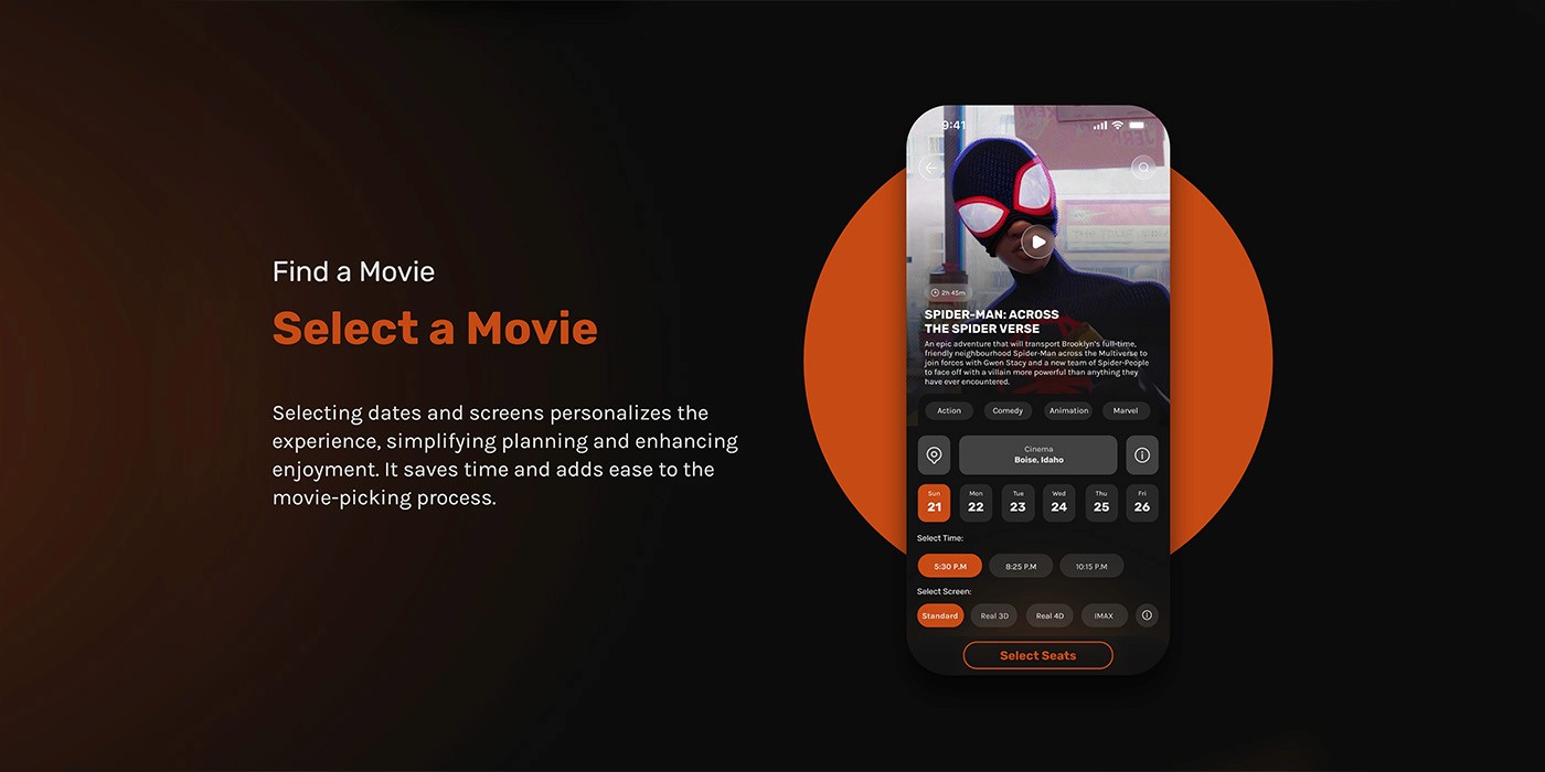
We set out to make buying movie tickets feel quick, obvious, and calm. With the research performed we were able to tackle two products: web and app. 

Our goal was simple: Avoid information overload and simplify flow complexity; users tend to respond better when they have faster results. We wanted to make this plarform fast, simple and intuitive; always keeping in mind the most important metric: time finishing (less than 5min).

We set out to make buying movie tickets feel quick, obvious, and calm. With the research performed we were able to tackle two products: web and app. 

Our goal was simple: Avoid information overload and simplify flow complexity; users tend to respond better when they have faster results. We wanted to make this plarform fast, simple and intuitive; always keeping in mind the most important metric: time finishing (less than 5min).

We set out to make buying movie tickets feel quick, obvious, and calm. With the research performed we were able to tackle two products: web and app. 

Our goal was simple: Avoid information overload and simplify flow complexity; users tend to respond better when they have faster results. We wanted to make this plarform fast, simple and intuitive; always keeping in mind the most important metric: time finishing (less than 5min).

We set out to make buying movie tickets feel quick, obvious, and calm. With the research performed we were able to tackle two products: web and app. 

Our goal was simple: Avoid information overload and simplify flow complexity; users tend to respond better when they have faster results. We wanted to make this plarform fast, simple and intuitive; always keeping in mind the most important metric: time finishing (less than 5min).

UX RESEARCH

UX RESEARCH

UX RESEARCH

We ran a focused usability study around the full booking flow discovery, seat selection, add-ons, and more. We then tested with users who book on the go and expect clarity at every step. The study measured things like time on task, error points, and conversion across each screen, with a special look at where people stalled or hesitated.


Framing the work this way allowed us to separate raw observations from reliable findings and saved the “what this means for the business” for the Insights section below this.

INSIGHTS

INSIGHTS

INSIGHTS

What we learned is simple: people move faster when the noise is reduced. We fix how the flow works from beggining to pay, we also added a live order summary so there are no “gotchas” at the end. That matters because hidden/unclear costs are a top reason people bail, and lighter forms lift completion.

We also kept the mental model the same across app and web. Same labels, same step order, same feedback so switching devices doesn’t mean relearning. That consistency lowers headches and builds a pattern, which is exactly what you want in a high-intent flow.

EARLY STAGE

EARLY STAGE

EARLY STAGE

Before diving into visuals, we mapped the full journey in low-fidelity. Paper sketches and digital wireframes allowed us to pressure-test the flow, spot redundancies, and validate early with users before committing to design polish.

These first prototypes highlighted where people hesitated—seat maps, checkout steps, and snack selection; and gave us a clear blueprint for simplification.

APP DESIGN

APP DESIGN

APP DESIGN

Seat selection was designed with color coded zoning and a live summary of price and picks. Snacks and drinks were integrated seamlessly with simple counters and flexible delivery or pickup options.

Checkout unifies everything: tickets, food, and fees; into one clear view. Multiple login and payment choices reduce friction, and the final confirmation screen reinforces trust with a digital ticket that’s ready to use or share.

Seat selection was designed with color coded zoning and a live summary of price and picks. Snacks and drinks were integrated seamlessly with simple counters and flexible delivery or pickup options.

Checkout unifies everything: tickets, food, and fees; into one clear view. Multiple login and payment choices reduce friction, and the final confirmation screen reinforces trust with a digital ticket that’s ready to use or share.

Seat selection was designed with color coded zoning and a live summary of price and picks. Snacks and drinks were integrated seamlessly with simple counters and flexible delivery or pickup options.

Checkout unifies everything: tickets, food, and fees; into one clear view. Multiple login and payment choices reduce friction, and the final confirmation screen reinforces trust with a digital ticket that’s ready to use or share.

Seat selection was designed with color coded zoning and a live summary of price and picks. Snacks and drinks were integrated seamlessly with simple counters and flexible delivery or pickup options.

Checkout unifies everything: tickets, food, and fees; into one clear view. Multiple login and payment choices reduce friction, and the final confirmation screen reinforces trust with a digital ticket that’s ready to use or share.